Redesign for the SAH annual magazine
After four issues with the same look, it was time for a redesign of the popular SAH annual magazine.
Client
Swiss Workers' Relief Organization SAH, Schaffhausen
The idea
After the SAH Schaffhausen annual magazine appeared four times with the same look (see our articles on the magazines "Wege," "Aufbruch," and Ankommen ," it was time for a redesign. In consultation with those responsible at SAH, we further developed, refined, and adapted the concept. The magazine is now called "Courage"—a fitting title, in our opinion, given that it takes a great deal of courage for refugees to immerse themselves in a new culture and find their way again after often traumatic experiences in life. SAH does a great job for these people.
After considering various options for the bold, monochrome cover, we now opted for a cover featuring a picture. The first issue with a photo on the cover sets the bar high: Nataliia at the table tennis club is a superb cover shot. We were delighted to not only create the conceptual work and the design, but also to create the photos for the magazine. The two photo reports at the Schaffhausen Boxing Club and the Neuhausen Table Tennis Club were particularly impressive. We met a lot of great people and were able to capture their portraits with our cameras. It's also cool that SAH took up our suggestion to produce the reportage section (a new section we also introduced as part of the redesign) in black and white.
The result is an all-around fantastic print product that provides a fantastic insight into the valuable work of the SAH. You can download the magazine as a PDF from the SAH website (at the bottom of the page).
Work
• Basic design and conception
• Take photos (especially boxing and table tennis reports )
• Design and typesetting
• Production planning and management
Personalized magazine for two holiday destinations
Personalized magazine for two unique holiday destinations in Ticino
Client
Casa Moscia and Campo Rasa, Ascona TI
The idea
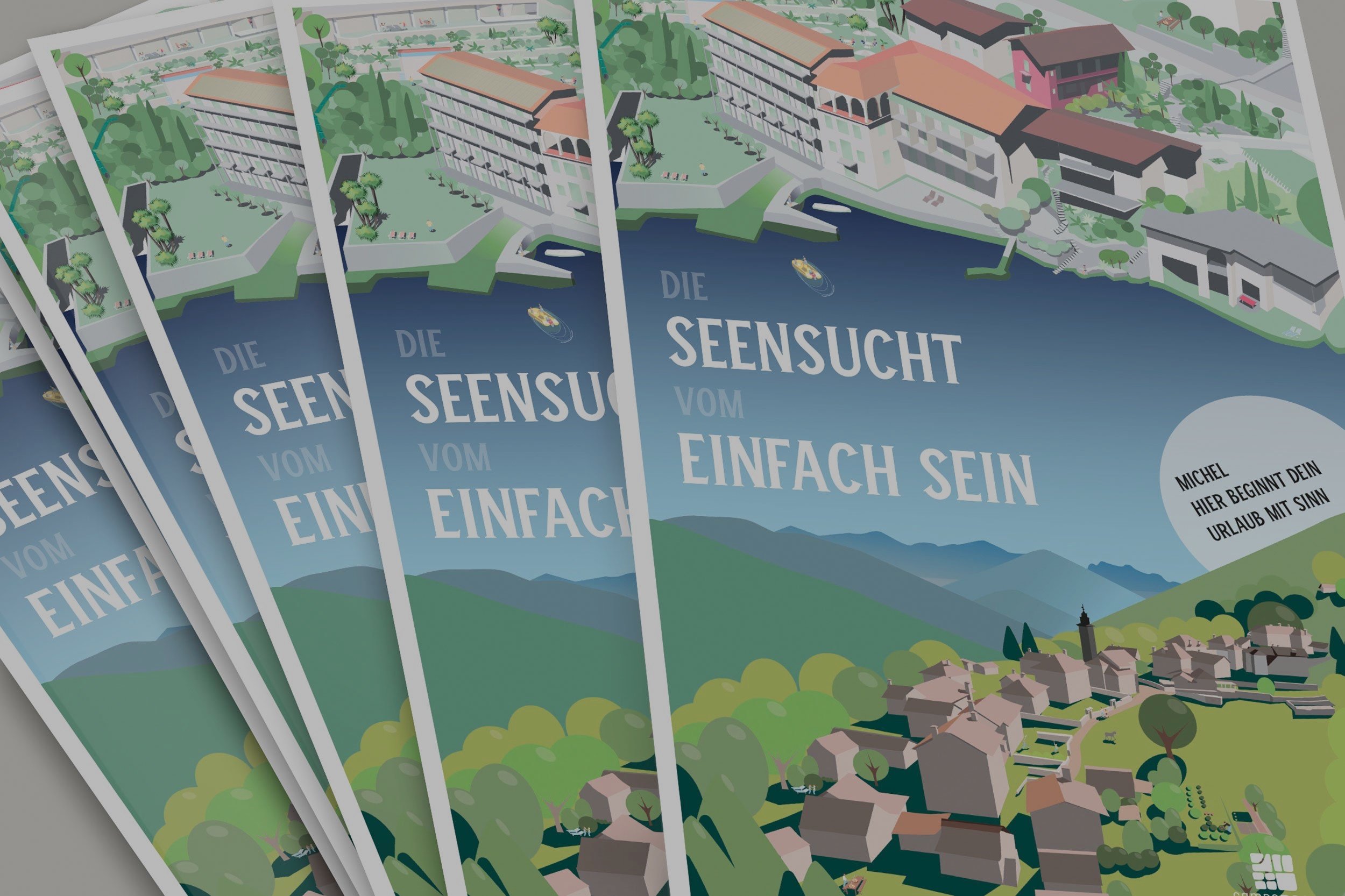
Casa Moscia and Campo Rasa are two unique holiday destinations in Ticino. A mailing is sent out for each of the new seasons. For various reasons, the mailing was brought forward to August this year. However, since a major renovation is currently underway at Moscia, it was difficult to work solely with photos. So the idea was born to create a detailed illustration for each of them and use them across various advertising channels. The magazine was personalized on the cover and page 2. This eliminated the need for a cover letter and allowed for more efficient use of the budget.
Although we are a small agency, we are experts in various disciplines of visual communication in-house. The client had a single point of contact for the entire project, and we handled illustrations, photography, typesetting, copy editing, prepress, and print production monitoring in-house. We were able to avoid the frictional losses that occur with larger agencies. This meant less work for the client and excellent value for money.
Work
• Basic design and conception
• Develop illustrations
• Take various new photos
• Design and typesetting within the framework of the CD
• Production planning and management
The magazine
The illustrations
Gabi Mache created one illustration each for Moscia and Rasa. Similar to a hidden object picture, there are many small details to discover. Read more in the separate article about these two illustrations .
Some photos taken for the magazine
We cover a wide range of tasks, not only in the field of illustrations , but also in photography —still life, architecture, landscapes, portraits, and even drone photography. Clients are increasingly requesting short clips for social media channels—we cover this area as well, again with the idea of offering our clients everything from a single source.
Annual Magazine 22/23 SAH Schaffhausen
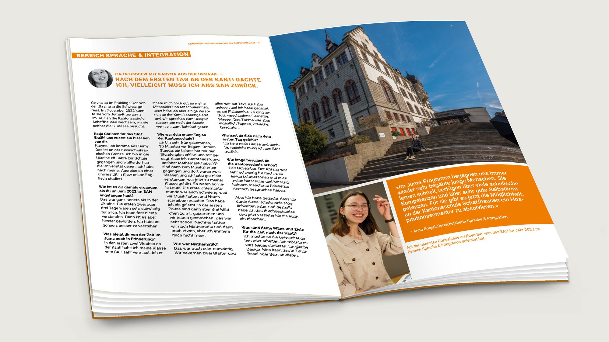
The fourth issue of the SAH annual magazine is dedicated to the theme "Arriving." A fantastic project for a great institution.
Client
Swiss Workers' Relief Organization SAH, Schaffhausen
The idea
This is the fourth time we've been honored to design for the annual magazine of the SAH Schaffhausen . The latest issue features the theme "Arriving."
SAH Schaffhausen offers many services and support for migrants. The SAH team does a great job. The SAH magazine tells the personal stories of migrants and employees. This gives the work a face and makes it personal. Part of the annual magazine also includes a balance sheet and income statement in the middle. Thus, the magazine also serves as an annual report for the association's members, institutions, and the public sector.
Work
• Basic design and conception
• Take photos
• Design and typesetting
• Production planning and management
From Casa Viva Magazine
On the occasion of the renovation of the two retirement homes in Neunkirch and Hallau, we designed a magazine for Casa Viva that can be used in a variety of ways.
Client
Casa Viva Chläggi, Hallau and Neunkirch
To mark the renovation of the two retirement homes, we developed a magazine concept with Casa Viva. This magazine was distributed to households in four communities prior to the open house, and it is also being printed and distributed.
Work
• Basic design and conception
• Take photos
• partially text
• Editing scrolling texts
• Production planning and management
Other work we have carried out for Casa Viva
• Logo design
• Conception and implementation of the Casa Viva homepage
Annual Magazine 21/22 SAH Schaffhausen
For the third time, we were honored to design the annual magazine for the SAH Schaffhausen and also take the photos. A fantastic project for a great institution.
Client
Swiss Workers' Relief Organization SAH, Schaffhausen
The idea
This is the third time we've been honored to design the annual magazine of the SAH Schaffhausen . Following the first two issues on the topics of "Happiness" and "Paths," the latest issue is themed on "Departure."
SAH Schaffhausen offers many services and support for migrants. The SAH team does a great job. The SAH magazine tells the personal stories of migrants and employees. This gives the work a face and makes it personal. Part of the annual magazine also includes a balance sheet and income statement in the middle. Thus, the magazine also serves as an annual report for the association's members, institutions, and the public sector.
Work
• Basic design and conception
• Take photos
• Design and typesetting
• Production planning and management
The jack of all trades
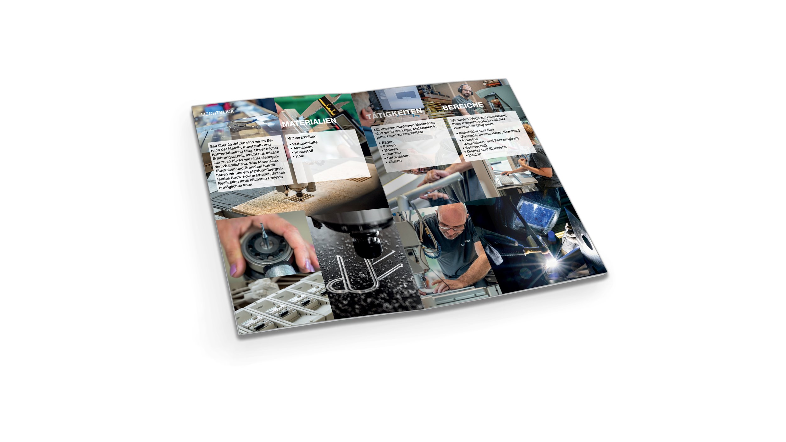
A visual eye-catcher that also symbolizes the diversity of our customer, the Werkstätte Liechtblick…
Client
Liechtblick workshop, Schaffhausen
The Idea
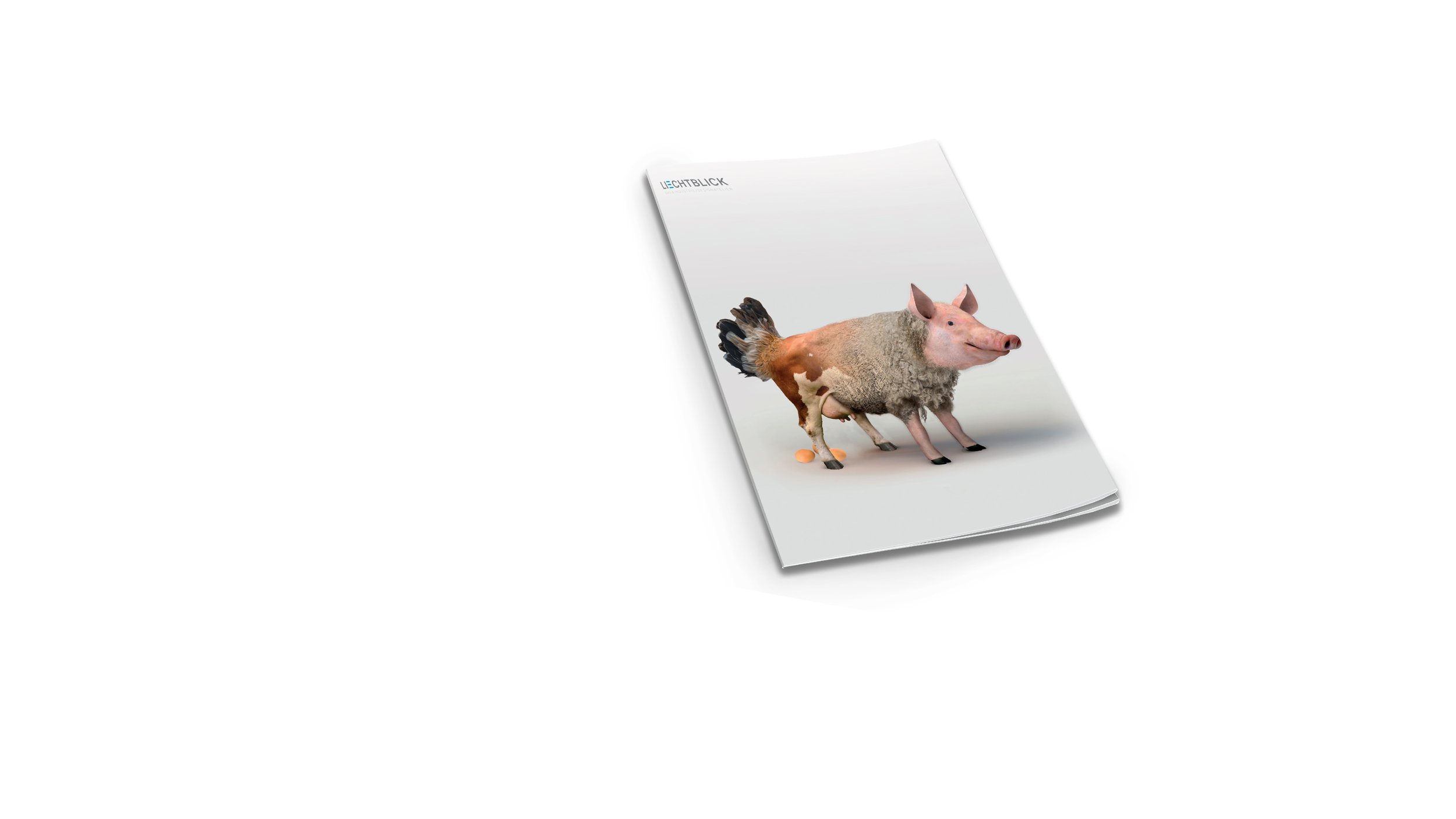
The Liechtblick workshop became known for its excellence in the construction of ventilated facades. But the company can do much more and is active in various other sectors, such as signage, prototype construction, and vehicle and mechanical engineering. At our meeting, in which we discussed a flyer to publicize this diversity, the following statement was made: "Actually, we're a jack of all trades." We used this well-known image, but unfortunately, couldn't find a truly beautiful jack of all trades in any image bank. So we created one ourselves. Here's a short video showing how Gabi Mache created the jack of all trades step by step in Photoshop:
We deliberately play with this symbolism of a metalworking company's ability to lay eggs, milk, and all. Because it definitely piques curiosity. And advertising has to be eye-catching, otherwise it's useless...
Work
• Basic design and conception
• develop a jack of all trades
• partially realize photos
• Design and typesetting
• Production planning and management
Annual magazine SAH Schaffhausen
The SAH Schaffhausen does excellent work for migrants. One measure to make the SAH's work known to a wider audience is the launch of an annual magazine.
Client
Swiss Workers' Relief Organization SAH, Schaffhausen
The idea
The SAH Schaffhausen offers many services and support for migrants. The SAH team does a great job, but its work receives too little public recognition. One measure to change this is the annual publication of an annual magazine. This magazine tells the personal stories of migrants and employees. This gives the work a face and makes it personal. In one section of the annual magazine, the balance sheet and income statement are also stapled in the middle. Thus, the magazine also serves as an annual report for institutions and the public sector.
Each issue focuses on a specific theme. The first issue was devoted to "Happiness," the second to "Paths."
Work
• Basic design and conception
• Take photos
• Design and typesetting
• Production planning and management
Rahel's Pumpkin Seed Cookbook
Rahel Brütsch of Brütsch erdverbunden GmbH had the idea of publishing a pumpkin seed cookbook. We were very keen to hear it.
Client
Brütsch earth-connected GmbH, Schaffhausen
The idea
Rahel Brütsch of Brütsch erdverbunden GmbH had the idea of publishing a pumpkin seed cookbook. To make the project as efficient as possible, she cooked all the dishes on the same day (!). A group of invited guests were able to sample the exquisite dishes, and we photographed all the menus, along with atmospheric shots. From these images and Rahel's manuscripts, the cookbook was created, which is now in its third edition.
Work
• Basic design and conception
• Take photos
• Editing scrolling texts
• Production planning and management
Further work we have carried out for brütsch erdverbunden
• Photography of pumpkin seed production – from the plant in the field to the finished product
• Photography for the cookbook
• Conception and implementation of the online shop
• Production of various other products
The Ecolite Magazine
A printed product that is much more than just a brochure.
Client
Ecolite AG, Wolfhausen
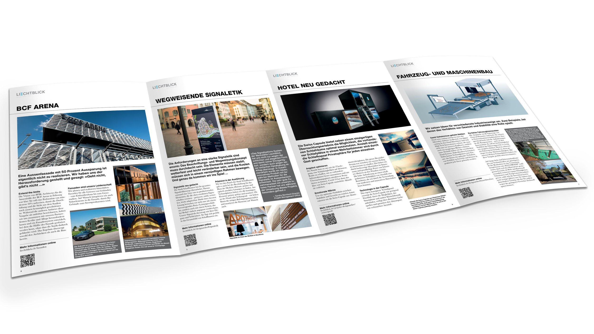
In addition to its new website, Ecolite AG wanted a print product to distribute and send to customers and potential clients. After a needs analysis, we suggested Ecolite design the desired printed material as a magazine – with interviews, know-how boxes, presentations of reference projects, and much more.
Work
• Basic design and conception
• Take photos
• Write headlines and lead texts
• Editing scrolling texts
• Production planning and management
Other work we have carried out for Ecolite
• Logo design
• Conception and implementation of the Ecolite homepage
• Photography of reference objects and company photos, including:
- Casa Bottinelli
- BCF Arena
• Production of the short film «Extend the limits»
Brochure for Casa Moscia / Campo Rasa
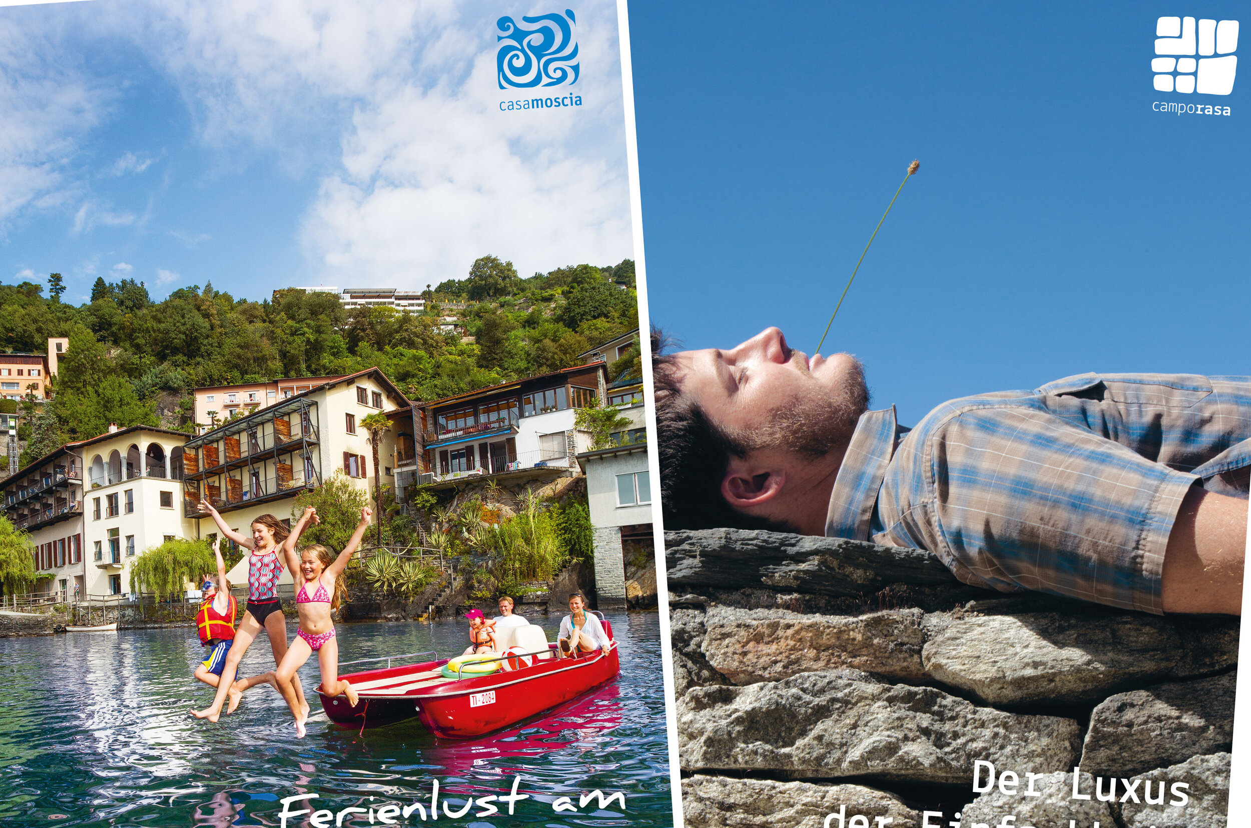
As part of a redesign and repositioning process, the two sister hotels, Casa Moscia and Campo Rasa, wanted to bring their visual identity closer together. In this context, a joint brochure was also being considered.
Client
Moscia House and Campo Rasa, Tessin
As part of a redesign and repositioning process, the two sister hotels, Casa Moscia and Campo Rasa, wanted to bring their visual identity closer together. To achieve this, we aligned their logos and developed a joint brochure. This way, every recipient of the brochure always has information about both hotels at their fingertips.
Work
• Basic design and conception
• Take photos
• Write headlines and lead texts
• Editing scrolling texts
• Production planning and management
Other work we have carried out for Casa Moscia / Campo Rasa
• Logo design: Develop a logo for Casa Moscia in the style of Campo Rasa
• Photography
• Production of various mailings and other products
• Support of the renovation project of Casa Moscia
