Personalized magazine for two holiday destinations
Personalized magazine for two unique holiday destinations in Ticino
Client
Casa Moscia and Campo Rasa, Ascona TI
The idea
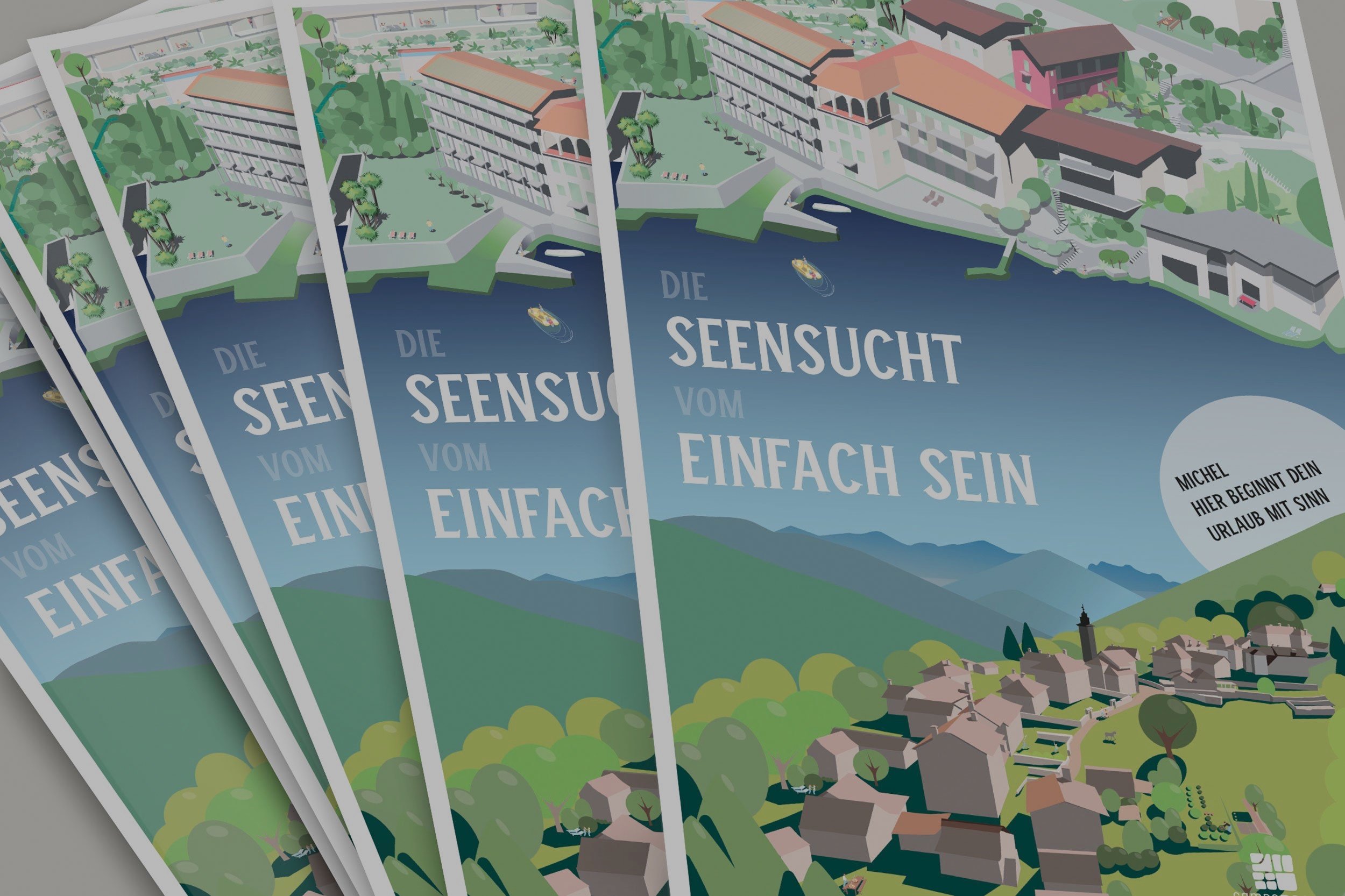
Casa Moscia and Campo Rasa are two unique holiday destinations in Ticino. A mailing is sent out for each of the new seasons. For various reasons, the mailing was brought forward to August this year. However, since a major renovation is currently underway at Moscia, it was difficult to work solely with photos. So the idea was born to create a detailed illustration for each of them and use them across various advertising channels. The magazine was personalized on the cover and page 2. This eliminated the need for a cover letter and allowed for more efficient use of the budget.
Although we are a small agency, we are experts in various disciplines of visual communication in-house. The client had a single point of contact for the entire project, and we handled illustrations, photography, typesetting, copy editing, prepress, and print production monitoring in-house. We were able to avoid the frictional losses that occur with larger agencies. This meant less work for the client and excellent value for money.
Work
• Basic design and conception
• Develop illustrations
• Take various new photos
• Design and typesetting within the framework of the CD
• Production planning and management
The magazine
The illustrations
Gabi Mache created one illustration each for Moscia and Rasa. Similar to a hidden object picture, there are many small details to discover. Read more in the separate article about these two illustrations .
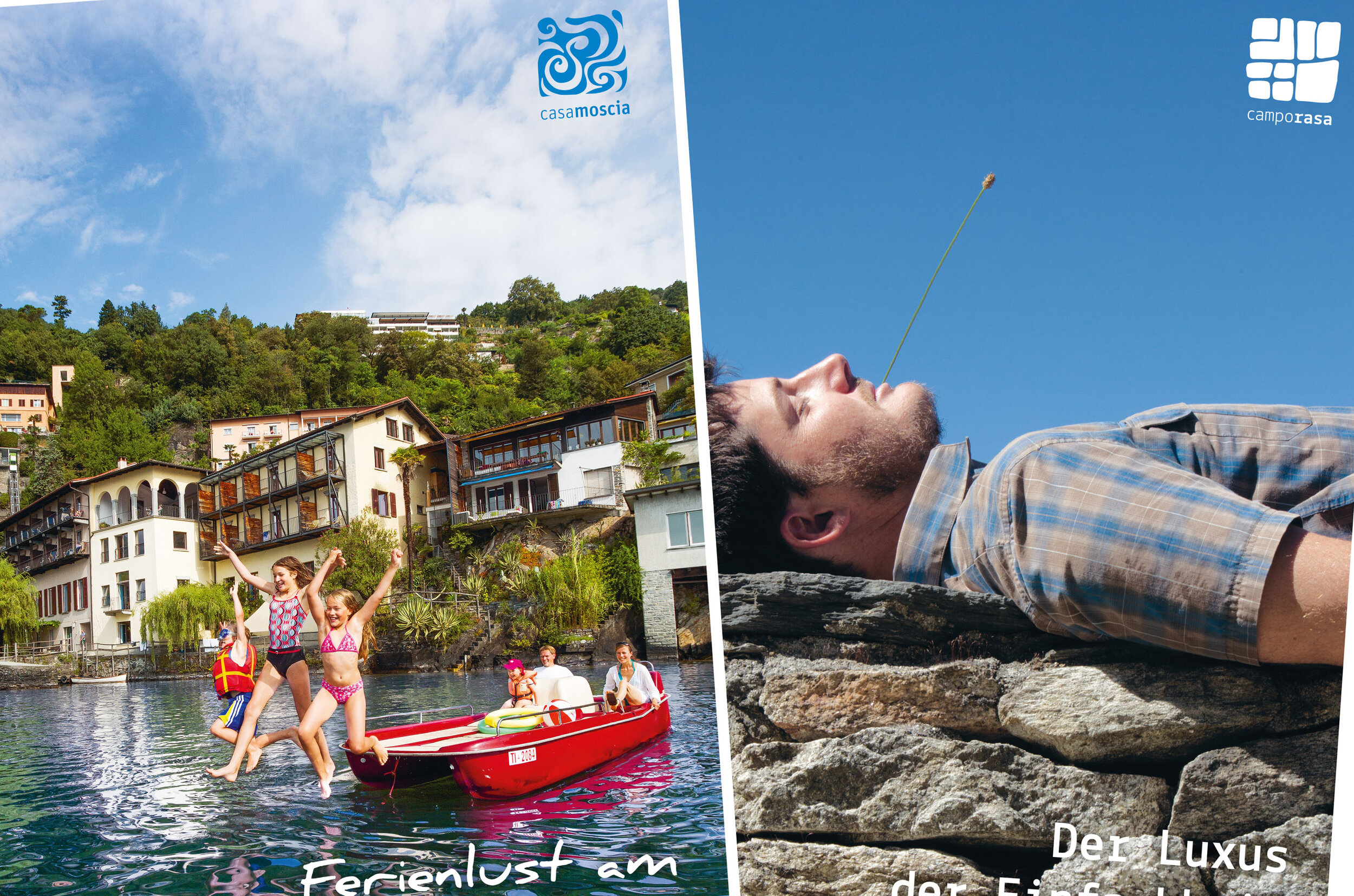
Some photos taken for the magazine
We cover a wide range of tasks, not only in the field of illustrations , but also in photography —still life, architecture, landscapes, portraits, and even drone photography. Clients are increasingly requesting short clips for social media channels—we cover this area as well, again with the idea of offering our clients everything from a single source.
Brochure for Casa Moscia / Campo Rasa
As part of a redesign and repositioning process, the two sister hotels, Casa Moscia and Campo Rasa, wanted to bring their visual identity closer together. In this context, a joint brochure was also being considered.
Client
Moscia House and Campo Rasa, Tessin
As part of a redesign and repositioning process, the two sister hotels, Casa Moscia and Campo Rasa, wanted to bring their visual identity closer together. To achieve this, we aligned their logos and developed a joint brochure. This way, every recipient of the brochure always has information about both hotels at their fingertips.
Work
• Basic design and conception
• Take photos
• Write headlines and lead texts
• Editing scrolling texts
• Production planning and management
Other work we have carried out for Casa Moscia / Campo Rasa
• Logo design: Develop a logo for Casa Moscia in the style of Campo Rasa
• Photography
• Production of various mailings and other products
• Support of the renovation project of Casa Moscia


