For the first time, we have developed a logo with a priority on screen display…
Client
ig inclusion, Schaffhausen
Ig inklusion is an association of various organizations and individuals that promotes diversity and inclusion. It connects companies with people and thus helps counteract the shortage of skilled workers.
Our task was to develop a small website. This process also resulted in a simple logo, which we developed primarily for on-screen display.
Work
• Design and fill the homepage
• develop a simple logo
The visual element
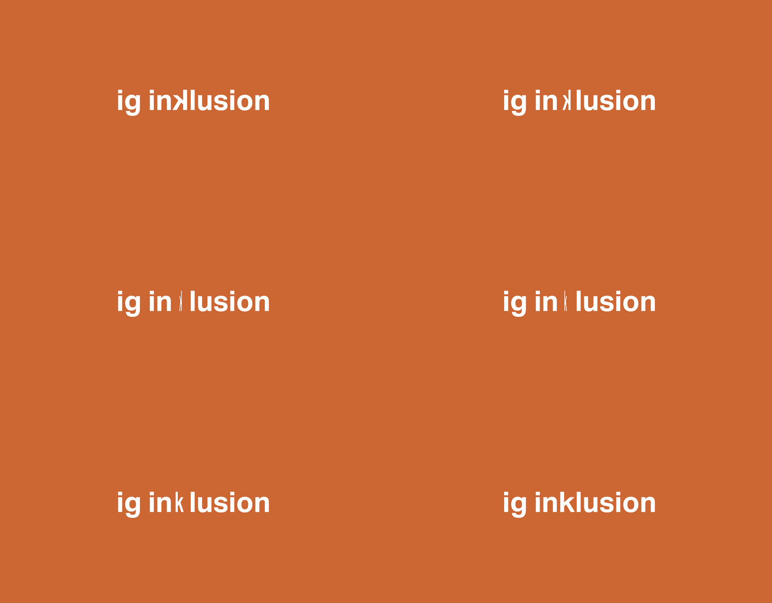
To visualize the idea of inclusion, the letter «k» rotates, symbolizing that all people have the same rights.
Implementations
New CD for the Kita kibis
SAH Schaffhausen, for which we design the annual magazine, has entrusted us with developing the corporate design for their new daycare center “kibis”.
Client
SAH Swiss Workers' Relief Organization, Schaffhausen
SAH Schaffhausen is moving into the steel foundry. The SAH daycare center, kibis, is getting new, beautiful rooms and expanding. We were commissioned to develop a corporate design for this new beginning.
Work
• Develop corporate design: logo and accompanying elements
• Posters
• Postcards
• Flyer
The visual element
The central element is the kibis logo. It was composed of various fonts, fine-tuned in collaboration with the clients, and colored to match the color scheme of the new kibis spaces.
The logo is vibrant, diverse, and unique – fitting for the new kibis at the Schaffhausen steel foundry. It's professional and highly recognizable. But the most important thing is that children have fun with it, can identify with the imagery, and feel comfortable with it. That's why the logo is accompanied by three appropriate animals. May we introduce them: an elephant, a sloth, and a zebra.
The elements can be freely combined
Implementations
Poster F12 in the Schaffhausen train station underpass
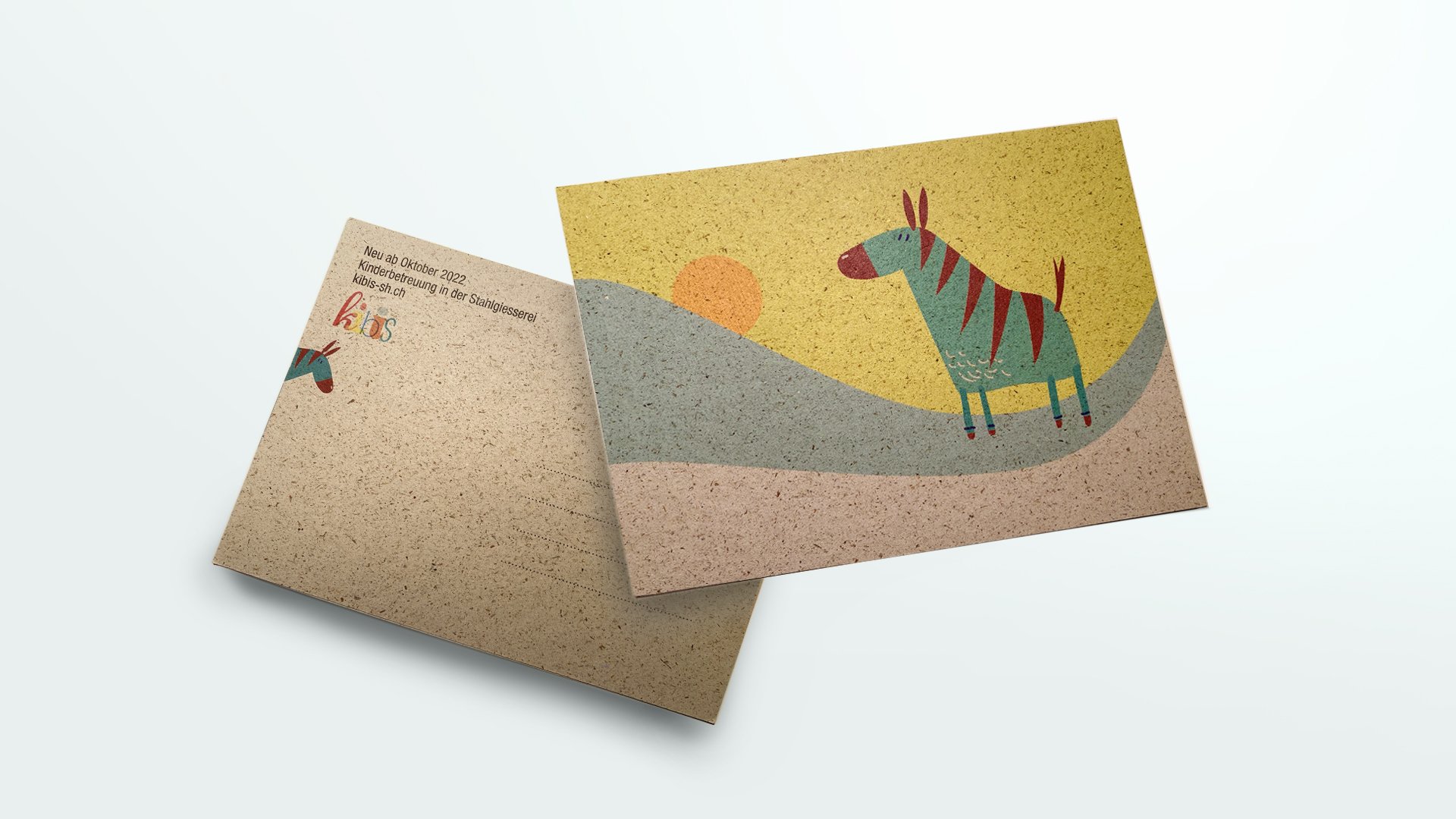
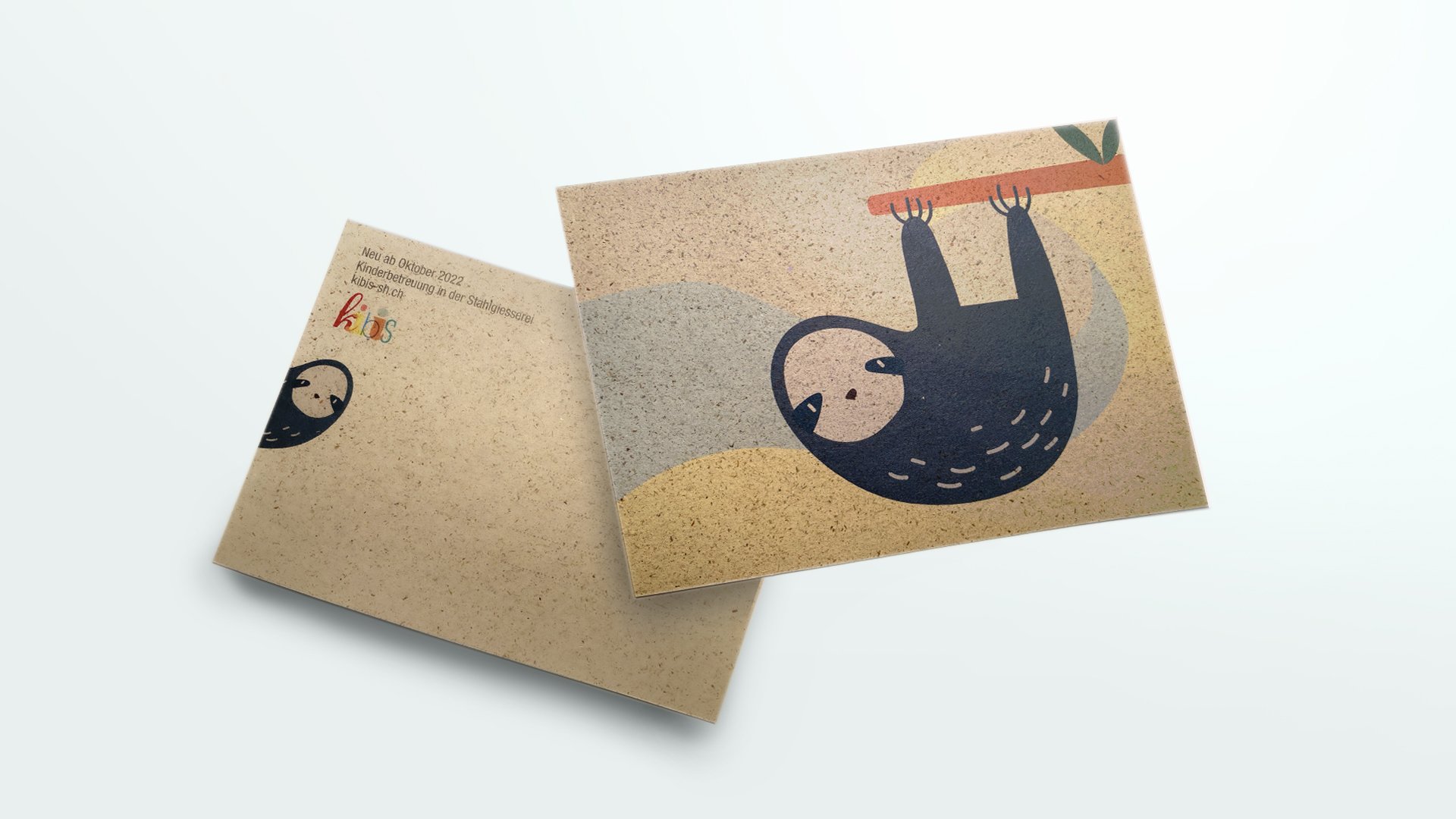
A6 postcards on recycled paper, widely distributed as information about the new kibis.
Mockup of a designed flyer
CD revision for Neunkirch
The municipality of Neunkirch requested a refresh of its corporate design. With great respect, we set about the task.
Client
Municipality of Neunkirch, Schaffhausen
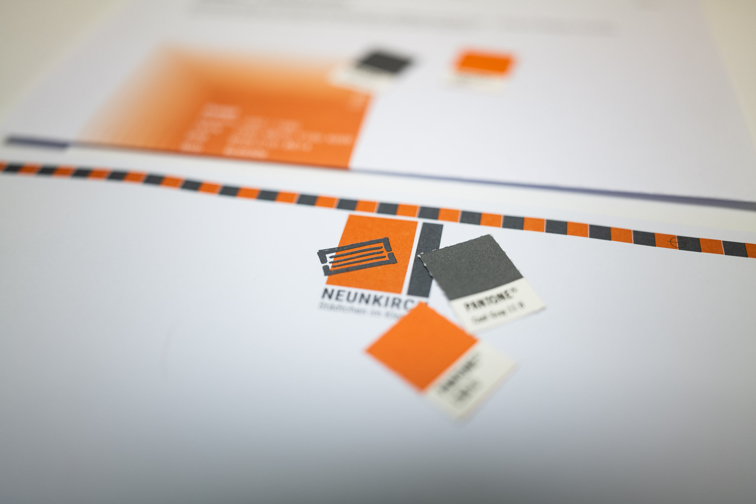
The picturesque community in the Klettgau region had a corporate design developed around 20 years ago. The company wanted to adapt its appearance to a contemporary design sensibility. The core of the existing corporate design was the symbolic shape of the town from above – the striking city wall and the houses within it. This element has proven very successful and therefore absolutely had to be retained. The colors gray and orange were also a given.
Work
• Develop corporate design: logo, forms, stationery, homepage header, PowerPoint template, steles
• Compile CD manual
The visual element
This is what Neunkirch’s performance looked like before:
The reinterpretation of the logo was intended to be lighter and more modern, moving away from the extreme horizontal format. Furthermore, the logo should be able to be used with or without the slogan:
With slightly adjusted colors and a new typography, the logo has a fresh look. We deliberately let the symbol for the town protrude into the white space, as a symbol of Neunkirch's openness to its environment. The large, orange area represents the warmth and charm of the town, while the gray bar to the right represents Neunkirch's solidity.
Implementations
Business card
Stele (mockup with image bank image)
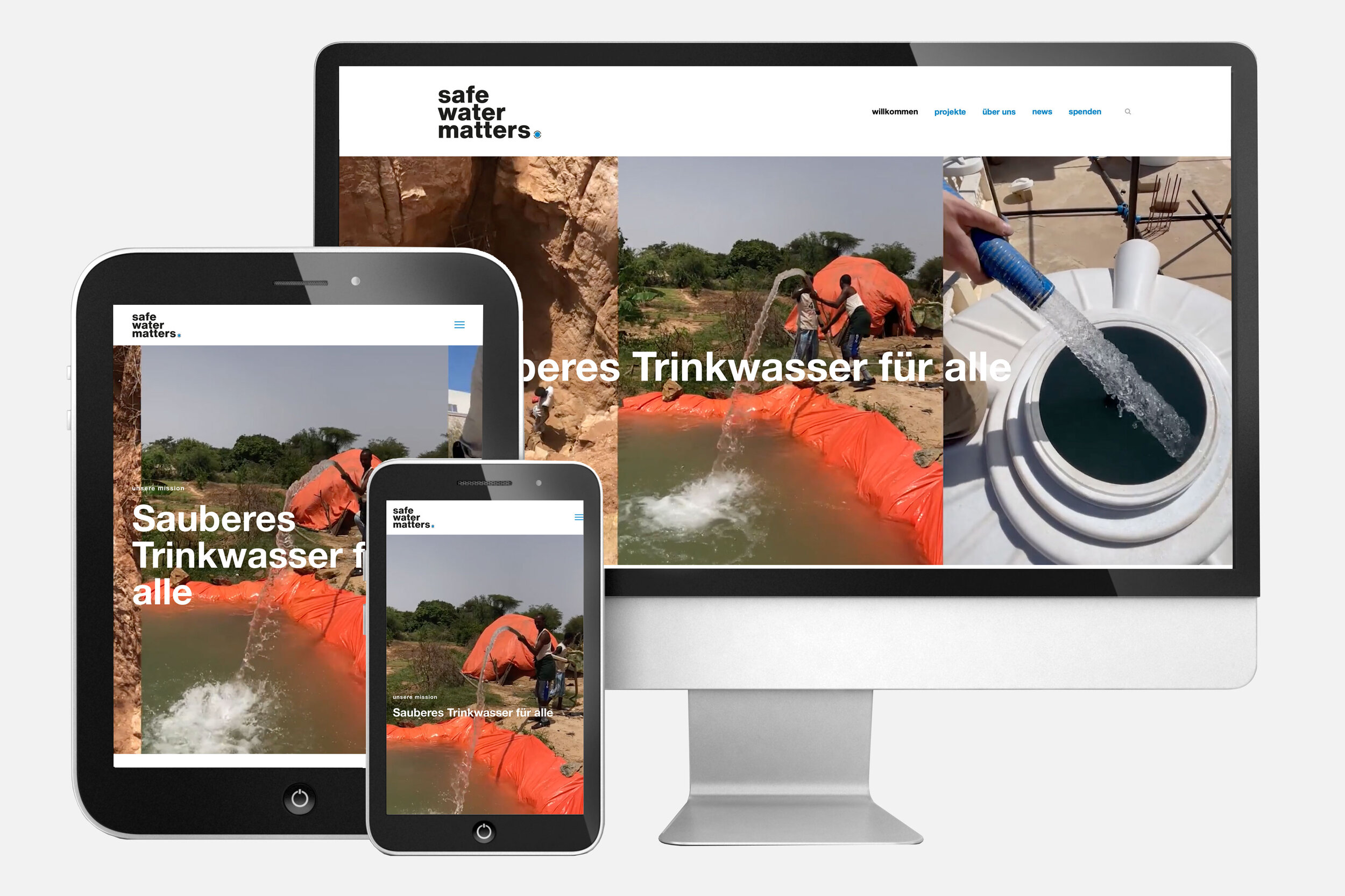
Safe Water Matters
Corporate design for an NGO that aims to provide access to clean water to as many people as possible.
Client
safe water matters, Abtwil
More than two billion people lack access to clean water. Safe Water Matters aims to provide access to clean drinking water to as many people as possible. To this end, the organization establishes social entrepreneur projects that become self-sustaining as quickly as possible. This avoids dependence on the West and accelerates the establishment of new projects.
Work
• Develop corporate design
• Programming a homepage
• Write parts of the homepage
The visual element
The visual element shows a water source, symbolized by a blue dot. This dot is largely enclosed. This visualizes the water's protection from pollution and other external elements. The small openings ensure that the water reaches those who need it.
The lettering
The bold letters, the compact representation and the water element as a dot visualize the urgency and importance of the message – safe water is crucial.
